Your Absolutely Free “How To Design The Perfect Opt in Page” training video and PDF Cheat Sheet are below.
You’ll be able to take what you learn, apply it to your business today and see almost immediate improvements in your opt-in conversion rates… which means you’ll be able to build a bigger list, faster.
It really doesn’t matter what your market or niche is, because…
These are the very same list-building strategies and techniques that I have used to quickly build email marketing lists… starting from complete scratch… in multiple markets and niches including…
- Dog Training
- Ebay Selling
- Facebook Games
- Marketing and Advertising
- Business Training and Consulting
- Celebrity Fan Sites
- Software and Software Services
- Dating
- And many, many more.
I have personally split-tested thousands of variations of opt-in in pages over the last 16 years… in multiple markets.
And my test results always say the same thing.
So, I’ve taken everything I’ve learned from my split-testing and developed my Perfect Opt in Page Formula (I teach you the EXACT Formula in this video tutorial).
I also walk you through several real-life examples of my highest-converting opt-in pages (and I tell you exactly what I did, and why they work so well).
Plus, I give you several “fill-in-the-blank” templates to use for designing your own high-converting opt-in pages that will help you increase your conversion rates and build your email list… faster.
Download Your Presentation Slides PDF
Enjoy!
Jeff Johnson
P.S.
I designed and built all the opt-in pages in the training video using OptimizePress (that’s my affiliate link, I may earn a commission if you invest in OP based on my recommendation).
I also use OptimizePress to design and build all of my launch funnels, my VSL watch pages, and my private membership sites.
Video Transcripts
How To Design The Perfect Opt In Page
Hey guys, it’s Jeff Johnson with jeffjohnsonmarketing.com and today I’m going to teach you how to quickly build a significantly bigger email list and I’ll start out by teaching you my perfect Opt-in page formula.
I will also share with you several real life examples of my highest converting Opt-in pages plus hand you a stack of fill-in-the-blank templates of my most powerful headlines.
I will also tell you how you can download your absolutely free PDF cheat sheet that walks you through all this stuff step by step. However, the first thing that I need to do is talk about why you need to learn this stuff in the first place.
Simple Opt In Pages Convert Best
I’ve personally tested thousands and thousands of variations of Opt-in pages in multiple markets that have added hundreds of thousands of subscribers and leads to a single list repeatedly. And my test results always say the very same thing…
Simple Opt-in pages with simple offers convert the best. So I’ve taken everything I’ve learned from all of my split testing and I have developed my perfect Opt-in page formula. And that’s exactly what I’m going to teach you today.
The Perfect Opt in Page Formula
Here’s the formula:
Pre-headline + Headline + Simple Instructions + Action Button = The Perfect Opt-in Page.
Now I know it sounds simplistic, but that’s exactly what all of my testing has proven. If you want to increase your conversions in the shortest time possible and with the least amount of traffic possible, then you can simply ignore everything else, all the fancy graphics, the fancy programming, ignore all that stuff and just boil your Opt-in page down to these four primary components because these are the four things that will help you create the perfect Opt-in page. So let’s take a look at each component as well as some real life examples.
Pre-Headline
Now the first thing that we want to talk about is the pre-headline and the pre-headline is the very first sentence or group of sentences that people see when they visit your Opt-in page. And it is extremely important that you get this sentence right.
So here’s some pre-headline tips that are designed to help you write more powerful, more compelling pre headlines.
The first one is writing pre-headline that speaks to your target market. So when you target market sees your page, the moment that they read that pre-headline, they should say this is for me. And then they’ll want to continue reading the rest of the page.
You also want to try using proven formats for your pre-headlines. So when you find something that works, well, use it again and again, that’s what it’s all about. So some of the proven formats that we use are the for people who blank format as well as the attention format.
And I’ll show you examples of those in just a few seconds.
You also want to write a pre-headline that includes the primary hook or the benefits of the lead magnet. So in one of the early tutorials that I shared with you, I taught you how to create the perfect lead magnet. We talked about the importance of designing hooks and benefits into those lead magnets. So then we can then take those primary hooks and benefits and we include them in the headlines in the pre headlines of our Opt-in pages.
So now you guys are starting to see how this stuff all ties together. Well, here’s an example of the “for people who” format.
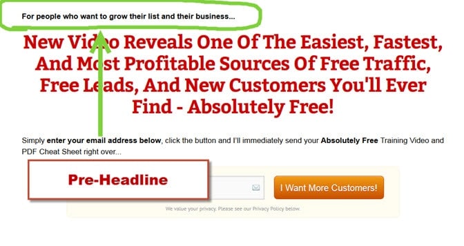
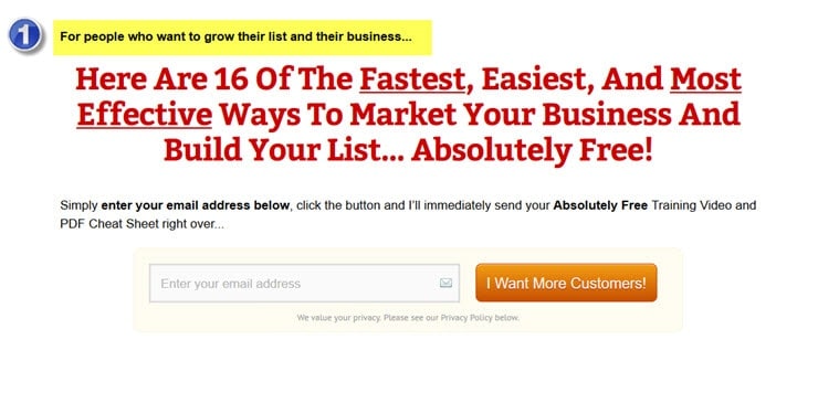
Now when people see this Opt-in page, the very sentence that they see is designed to speak to my target market and that pre-headline, that sentence says for people who want to grow their list and their business, this particular pre-headline works extremely well for our Opt-in pages.
Another one that works well for us is the attention format.
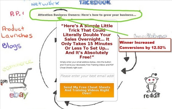
So the pre-headline on this Opt-in page says, “Attention business owners, here’s how to grow your business.” And just by adding that one pre-headline, by testing that version versus a different version, we’re able to increase our overall conversions by 12.52% 12.52% increase in our conversions by simply testing different pre-headline formats.
My Highest Converting Headline Templates And Examples
Now the next thing that we want to talk about is the headline. And I’m sure most of you know what a headline is, but just in case you don’t, the first thing that happens in the page is the pre-headline. It speaks to our target market and it hooks them and it reels them in to read the rest of the page, but it is the job of the headline to really set that hook, to suck them in, to bring them in to read the rest of the page and to join your mailing list and they work together.
So if you want to write extremely powerful headlines, here’s some tips for you.
You want to make the big believable and achievable promise in your headlines. You don’t want to simply say, “Join my mailing list.” You want it to be big, bold, and believable. Now, we talked about the big promise in some of our prior tutorial, so I won’t dwell on it here, but there is no such thing as a market that does not respond to a big promise. It has been proven over and over again that if you want to increase your conversion rates, no matter what your market is, make the big promise.
You also have to use a unique hook or a benefit for each one of the headlines that you’re testing because we’re testing different variations of headlines in trying to improve our overall conversions.
And you want to test using different headline templates and styles in order to increase your conversion rates.
So here’s an example of one of the headline templates that we’ve used for multiple products. And even though we’ve used it before, and even though a lot of our target market has already seen it over and over again, it still works extremely well for us. And the headline template is, give me _____ and I’ll give you _____. So you just fill in the blanks.
An example is, give me 22 minutes and I’ll give you a bigger, more responsive list.
So we’re simply filling in the blanks for a proven headline template and it works extremely well for us.
And here’s an example of another test that we’re running where we’re trying to test different hooks, different benefits that people respond to. So we’re running a test for different hooks. We use identical Opt-in pages. The pre-headlines are the same. The basic fundamental format in wording of the headline is the same.
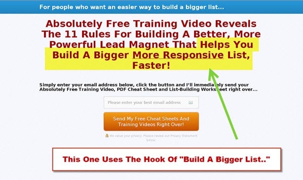
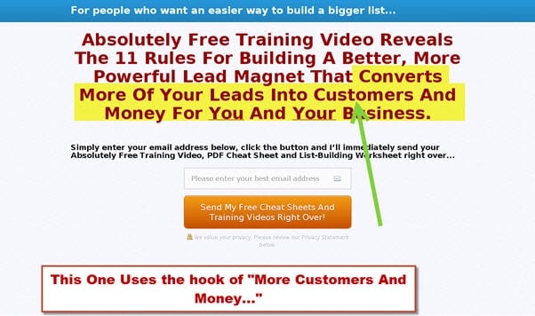
However, we swap out the hook, so in this example, the headline says, “Absolutely free training video reveals the 11 rules for building a better, more powerful lead magnet that helps you build a bigger, more responsive list faster.” Now, that last part that you see in yellow, that’s the hook that we’re testing.
Now we go to the next test that we run and the page looks absolutely identical. Everything is the same with one exception. The part that you see in yellow is a different hook that we’re testing and the new hook that we’re testing is more customers and more money.
…my testing has proven that if we add the words absolutely free to our Opt-in page, our conversion rates will go up substantially.
Now, something else that you’ll notice in my headlines and also my pre-headlines is the phrase absolutely free because beyond a shadow of a doubt, my testing has proven that if we add the words absolutely free to our Opt-in page, our conversion rates will go up substantially.
So you need to figure out where you can work the phrase absolutely free into your Opt-in page. We usually do it in our pre-headline or headline, but sometimes we’ll bury it wherever we can. Sometimes we just simply put it in the simple instructions themselves, but tested out, absolutely free is a phrase that you should be adding to your Opt-in pages to increase your conversions.
Simple Instructions
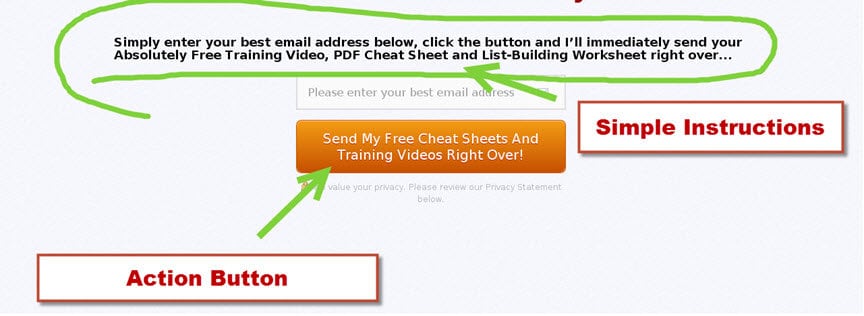
You need to tell them what to do, how to do it, and make it easy for them to do it.
Now the next thing we’re gonna talk about are these simple instructions, and those are the instructions on your page that usually occur just above your Opt-in form, where they can enter the email address and it tells them what to do, how do they get your email address? Or how do they get on your email list?
Now you want to make your instructions simple and easy to understand. You want to tell them what to do, how to do it, and make it easy for them to do it.
And you want to reinforce the hooks or benefits from the headline in the instructions themselves. So here’s an example.
Action Button Design
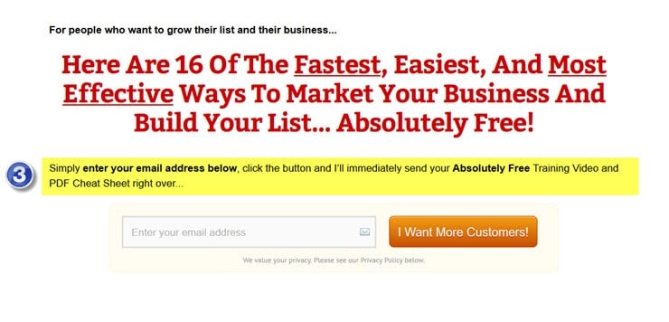
Now the fourth thing that we’re going to talk about today is the action button itself. Here’s an example of it. It’s the orange button that’s on the page highlighted in yellow and it says, “I want more customers.” That’s the button that they click in order to actually join your mailing list. They can’t do it until they click that button. So that’s why we call it the action button.
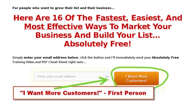
Here’s some action button tips for you:Take the hooks from your best headlines and create several calls to actions from them. Test using the first person in your calls to action. I’ll show an example in a second. And you want to test different shapes, sizes, and colors for the action button itself. And you want to use colors that really stand out in the page. So use a color that’s bright, that’s bold and preferably is a color that you don’t use anywhere else in the page itself.
In the example above, my action button is a bright orange color. It stands out on the page and orange is not used anywhere else on this entire page, you’ll also notice that the call to action text, that’s the text that’s inside that button is written in the first person. It says, “I want more customers.” I want more customers also reinforces one of the primary benefits of joining our mailing list because that entire Opt-in page is talking about helping them grow their business and to build their list. So obviously they are business owners and business owners always want more customers. I want more customers. They click the button, they join my list.
And here’s another example of the call to action text that is inside the action button that is written in first person that also reinforces the primary benefit from the headline.
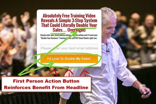
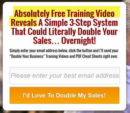
So the headline states, absolutely free training video reveals a simple three step system that could literally double your sales and then the call to action text that’s inside that action button says, “I’d love to double my sales.” And they click that button and they join my mailing list.
Now that’s it for today’s presentation folks.
If you enjoyed today’s presentation, please do me a favor… Give it a thumbs up and share it with your friends on social media.
My name is Jeff Johnson. I appreciate your time and we’ll talk again very, very soon.

Leave a Reply